I am a UI guy, meaning UI is very important to me. Both in terms of usability as well as in terms of design. I have to admit that I am not the biggest fan of the new Eclipse 4 design, but I want to point out that I do see improvements from 4.2 M5 to 4.2 M6. Firstly, the splash screen. I did not like the original Eclipse 4 splash screen at all (no offense). The current splash screen looks much better imho. My personal color reception has some small issues with the (azure blue) background in conjunction with the (more purple) Eclipse logo but overall I like the new splash screen.
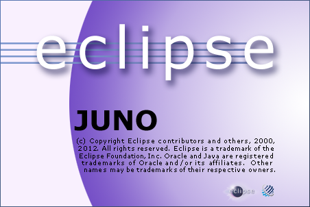
Here is the old 4.2 M5 splash screen:
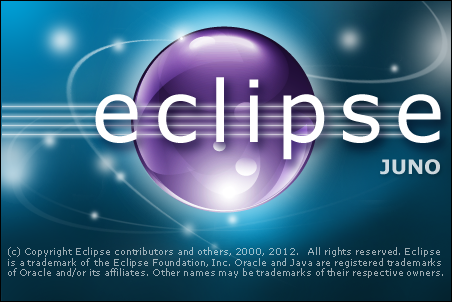
and here is the new 4.2 M6 splash screen:
You might think: Who cares about the splash screen? Actually many people do care because that’s the first thing you see when you launch a new software product. I you like it and find it great, then it is more likely that you also like the actual software.
Another improvement is the enabling and disabling of some icons. The picture below shows 4.2 M5. The disabled save and save-all icons are rendered monochrome.
In 4.2 M6 it looks much better:
You might also notice that now the Package Explorer tab got a gradient background. These are little things but In my point of view they sum up. And all these little things make the overall experience more delightful and give the product a more professional touch.
My last question is: Do you think I am a nitpicker or do you agree with me?
CU at EclipseCon!
Kai
You find me on Twitter and Google+.
Next Eclipse RCP 3.x/4.x trainings in Munich


While many people May think you are nitpicking but I agree with you. These little things adds the professional touch to the product.
Also spacing in default theme in 4.2 should have been Eclipse classic. Current default theme has too much of space.
I agree with you. It is extremely important. We have had many compliments about the ui of our eclipse based products.
The new splash is fantastic. Did Nathan Gervais design it? It looks like his style.
@Santhosh
you can tweak some parts of the the spacing using css styling 🙂
@Wim Jongman
I actually don’t know who designed the splash screen. Do you like the colors?
It was Jinsil Boo! She designed this awesome M6 splash. I hope she can do something for the Nebula logo as well!! 😉
The splash image is much better, though the colours and blobs remind me of a Kubuntu login screen. The icons are better. The rest of the new default Eclipse 4 look is pretty awful. Far too much wasted space for a start. Just because displays are bigger or higher resolution nowadays is no excuse for wasting space which could be put to better use for other things, especially when it wasn’t overly crowded in the first place, especially when we need more and more stuff displayed anyway. And more significantly, especially when a lot of people use laptops which means they actually do NOT have a huge display to look at. In general I get the impression that there’s too much trendy / not thought through / slavish copying of various other recent UIs. That’s just not appropriate, not necessarily nice looking, and far too pseudo-fashionable rather than functional. So now the UI as a whole is fragmented and inconsistent and ugly. It’s a conglomeration of different and clashing styles. It’s harder to use, harder to see, it’s a step backwards, it’s worse. For example: What’s with the very light grey text for things that aren’t highlighted? Doesn’t anyone understand the basics of human vision and good UI design? It’s too hard to see. Also not everything that’s not in the foreground should be de-emphasised anyway, and certainly not to the point of near invisibility. And what about the very light separator lines which become totally invisible for a lot of angles on a lot of LCD displays. And various other bits of colouring which results in other things such as background tabs blending together into a pale sea of nothingness. And that dreadful blue toolbar with the faux rounded effect. Where did that come from? It’s totally out of place, matches nothing else and looks ridiculous and ugly. Sorry folks to be critical, but all of this is old-hat, standard UI design stuff which is standard for very good reasons. Because of long experience, loads of studies, and because human eyes and vision do not change. New is not always better. Yes, the Eclipse UI could be improved. But what’s there right now in 4.2 is not good enough. Personally I dislike it so much I don’t even want to use it and I fear it will create a bad impression on potential new users. (And no, returning to the “classic” view is not a solution…)
@Jon Lee
Thanks for your thoughts. I guess your comment is the longest I ever got. This shows clearly that you really care about the e4 UI.
I love these kinds of discussions but the forum is really the place for it. Here is a thread that I dug up when the transition was made from 2.1 to 3.0.
http://www.eclipse.org/forums/index.php/mv/msg/65997/207414/#msg_207414
@Jon Lee
Jon the best chance to get your issues addressed is to open bugs with screen shots showing the problems. Particularly things that you believe are impacting usability for you.
As to “old-hat”, the truth is that UI design moves forward, just like everything else we do — “standard” things matter, but only until they are replaced by new standards. For example, if you had asked the UI design world if not having visible scrollbars would be ok a few years ago, they would have laughed at you, but now the whole world is heading that way (Mac, Linux, Win8, web, tablets…).
Time will tell whether _new_ users are offended by the new look, but given that it *is* more modern than the old one, odds are they’ll probably think it’s fine. It’s usually those who have to live through the change who complain. And boy, if you think people are complaining about the 4.x UI, you should have seen how much complaining there was when we went from 2.x to 3.x. 😉
Love hurts – that appears to be true at least on linux. I’m sorry to say but eclipse 4.2 M6 for all but the splash screen looks alien and I’d even say worse than Netbeans on Ubuntu 12.04 or Linux Mint.
The tabs are regarding color, font size and background color simply ugly, just like the toolbars. Wasn’t SWTs big advantage to look and acutally be native?
@Stefan, please file bug against all the issues you have.
The new Eclipse looks good on Windows and OSX. It’s a massive shame about Linux though. It’s almost unusable due to the inappropriate use of spacing. The tabs are too thick, the borders are too thick and everything is generally too big and clunky.
The size of the icons and their padding in the package viewer is such that I can see just a handful of things at a time. I wish Eclipse on Linux could look nearly as nice as it does on OSX. This is more than just aesthetics, the thick padding makes it quite unusable.